Tom Manley


What I like about Manley’s work is how his use of monochrome tones add to the clinical and hard feelings of his images. They are simple and yet the repeating patterns, emphasised by the monotonality, draw me in and hold my attention. While the second image lacks in contrast, the softness and pale blues in the clouds of the first image balances with the hard textures of the building. The patterns in both images add further interest; from the repeating dots on the building to the left and the light grey squares on the building on the right. Both of these images are different and yet similar; the first image is dark and gritty which make me feel cold and detached. However, the first image is very bright, the light from the windows pours in and emphasise the whiteness of the walls. This image is very calm, and yet even though it is almost completely white there is still enough interest for it not to be boring. A similarity between them would be the interesting angles that they are shot at. Neither of these images are straight on, and so the perspective is unexpected and further adds interest to these images.
Neale Smith


All three images shot by Smith are straight on and very symmetrical; the third image of the library is lined up perfectly so that the pillars and book cases frame the hallway leading us out of the room. The second image is shot so that the table is in the bottom of the centre of the image and the light above it lines up perfectly in its centre. By doing this we are continuously brought back to the centre of both images; the uniformity is both calming whilst also being slightly unnerving. Particularly in the middle image; the stairs on either side line up with the pattern of the flooring as well as both walls matching each other almost exactly. By doing this so precisely, Smith has caused this image to look as if it is a mirror image split down the middle which I find to be quite bizarre in a way, but also causes me to spend a lot of time looking to see if there are any discrepancies.
The first image, while also very symmetrical, is slightly different in that if you look very closely to the people around the building you can see that there are a lot more people on the left hand-side than there are on the right. I find this quite interesting considering the great lengths that Smith took to ensure the other images are so perfectly symmetrical. Of course, we cannot always control people in an image, but I actually think this was slightly intentional as the left hand-side is also much brighter than the right and so it is as if the people bring brightness to the building, whereas the left hand-side looks darker and therefore a bit lonely.
Blink Imaging


I found these images from Blink Imaging to be very striking and their use of lighting and composition really drew and held my attention. The first image uses mainly paler tones like the dull blue in the sky, and the brighter yet pale tones of the blue lights on the top of the building, as well as the grey/cream tones on the rest of the building. These tones are contrasted by the pops of orange from the streetlights, as well as the warmed tones of the lights on the building itself. In this image we are shown only part of the structure and so the perspective gives little information on the actual size of the building. By shooting it like this it makes me feel that the building stretches beyond either side of the frame and so feels large and impactful on its surroundings.
The second image is similar in style by the use of calming, pastel tones from the sky as well as the dull greys on the bridge. Again, warm tones are dotted throughout the image in the sky and in the lights in the background which contrast with the cool tones of the top of the sky and the bridge itself. The perspective of this image is also very interesting; and Blink Imaging have again used their composition to give a feeling of the structure imposing on its surroundings by how large it seems to be.
The small details in both images like the trees in the first image and the white railing in the second image add small pockets of texture which contrast with the rest of the image and so give these images depth.
Zac and Zac Photography
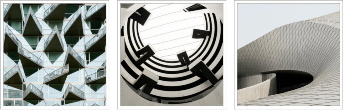
The creative use of composition in all three images are what struck me most about Zac and Zac Photography’s architectural work. All these images are so different and yet you can see a theme in their style; they are sharp and uncomfortable in how they are composed and the contrast in tones emphasises their oddness. The first image is the most colourful of the three and yet the tones are washed out from the highlights of the sun, contrasting with the dark shadows from the triangles which jut out from the building penetrating the air around them. We are cropped in very close, with the building seemingly not able to be contained by the frame which again adds to this feeling of strangeness.
The middle image is similar in that there is a lot of strong contrast between the shadows underneath the building and the sections where light easily reaches. Interestingly; because of the composition the image looks flat in some ways. The patterns caused by the structures which stick out into the centre could easily have been drawn on to the ceiling and therefore made to look 3D and so I feel that this has been shot intentionally to give feelings of uncertainty and to cast doubt on the “realness” of this image. The lines in the very centre at the top look distorted and slightly bent in the middle which furthers my thoughts of other-worldliness.
The final image I chose is most different from the other two; it is far smoother and less jarring than the first images. However, there are still similarities in the use of contrasting tones as well as the composition. The structure is photographed so that it is spilling out of the frame and so by doing this we are made to feel as though the structure is too large and imposing to be fully captured in one frame.
Mark McColl


What I really love about these images by McColl are how dramatic they are; the shadows in the building are so black you can barely see any detail in them, the highlights are muted and yet because the shadows are so dark, they still contrast with them well. A long exposure has been used to smooth out the clouds in the sky and the contrast between their softness and the sharp points on the building as well as the gritty textures of the stone path further add to the drama of both of these shots. Interestingly, these buildings are the same and yet because of the perspective they look quite different. The first image looks much taller, and the tallest spike looks most pronounced whereas the second building looks wider and shorter, with the spikes looking more similar in size to each other. Additionally, because of the angle of the first shot all of the glass on the building is black, whereas in the second image we can see the highlights in the glass which allows the shape of the building to be mimicked in the shadows underneath it.
By shooting these images in black and white it further highlights the drama, the grittiness, and also the contrast and so it makes both of these images more interesting to look at.
Bibliography
Online Sources
- http://tommanleyphotography.com/architecture/ Accessed: 25.10.18
- http://www.nealesmith.com/work/architecturalphotographer/edinburgh-university/ Accessed: 25.10.18
- http://www.nealesmith.com/work/glasgow-interiors/ Accessed: 25.10.18
- https://www.blinkimaging.co.uk/architecture/ Accessed: 25.10.18
- https://www.zacandzac.co.uk/architectural-abstracts/ Accessed: 28.10.18
- http://www.markmccoll.co.uk/photo_13601623.html#photos_id=13601623 Accessed: 28.10.18
