For my Advanced Image Editing unit, I have been tasked with researching and deconstructing 10 advanced image editing techniques. I will use screen grabs to further illustrate these techniques as well as discussing what these techniques could be used for i.e. fashion, editorial, advertising etc. and how impactful these have been on the photograph itself.
Image 1 – Double Exposure
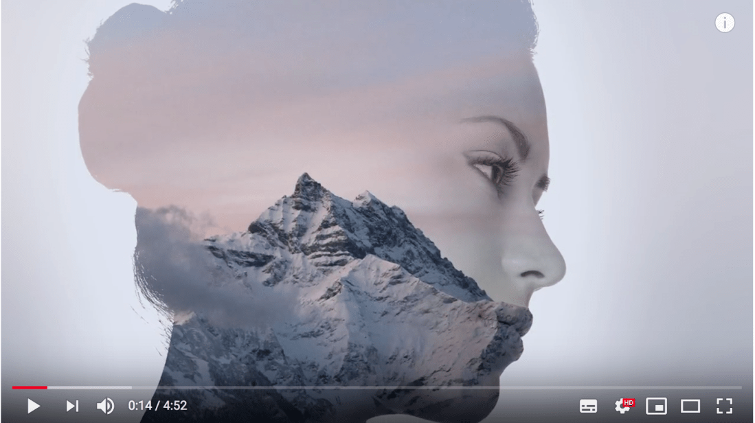
For this technique two exposures are required; one which is to be used as the main shape of the image, in the above that is the portrait. The other image is a landscape; however, this is not a necessity. Before starting the double exposure, it is important to edit both images to remove any blemishes as well as sorting exposure/colouring. Once complete, crop both images to the same size, then we need to separate the portraiture image from its background. Click on the channels panel and find the channel with the most contrast. Once selected, drag the layer into the “New” icon to duplicate it. Then in the adjustments panel, select “Levels”. Moving the midtones and shadows sliders towards right to darken the image, do this until the outline is sharp and defined. Once darkened, select the brush tool and paint in any leftover highlights or details with black.
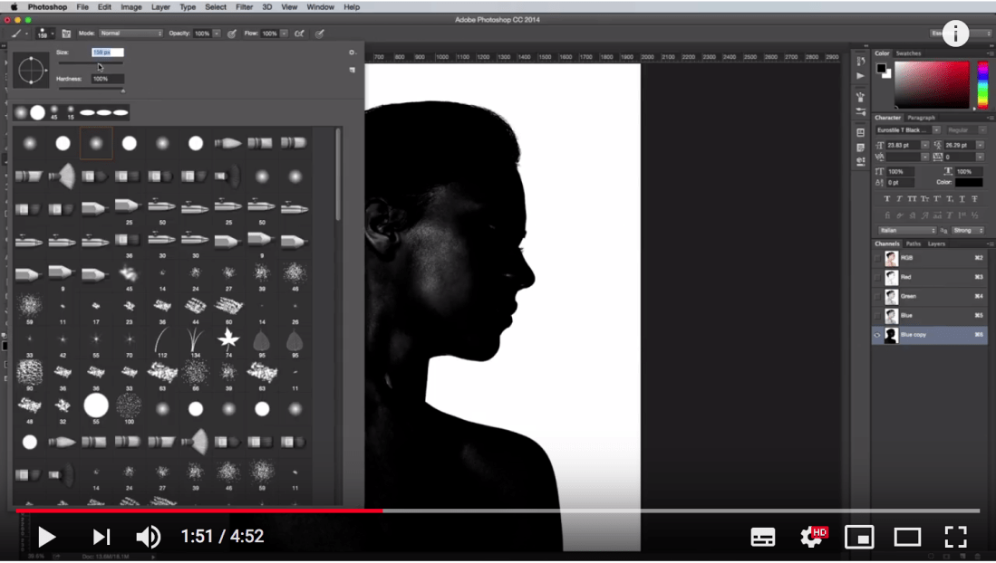
This will create a silhouette of the portrait. Once silhouetted, click back on to the RGB channel to return back to normal and then press “CMD+Click” on the duplicated channel to load the selection. Once selected, go to “Select” and then “Inverse” to inverse the selection. Returning back to the Layers panel, confirm that the background is selected, and Copy and Paste the selection onto an additional layer. Fill the original background layer with white, and then paste your landscape image into the Photoshop document.
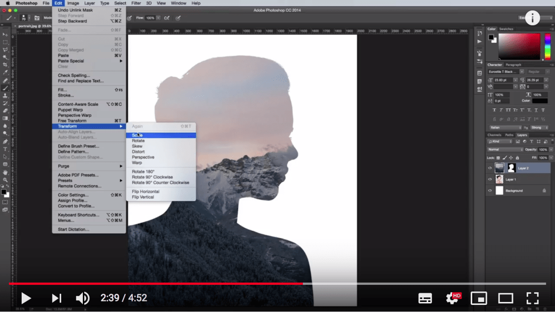
Once inserted, move the landscape image to the top of the layer stack. To clip the landscape; hold “CMD+Click” on the portrait layer, then apply a Layer Mask by clicking on the Layer Mask tool at the bottom of the layers tab. Following this, un-link the mask with the layer by clicking on the chain icon. Select the landscape layer and select Edit > Transform so that you can alter the scale of the image as well as position it to what you desire.
Select the original portrait layer, and press “CMD+J” to create a copy of it. Once duplicated, move it to the top of the layer stack and then select Image > Adjustments > Desaturate to change the image to black and white, and then change its blending mode to “Multiply”. Once this is selected you will see detail of both the landscape image and the portrait image. If desired, the image could be left like this. However, for a true double exposure look you will apply another Layer Mask, then select a large, soft brush, with a black fill and paint around the edges of the portrait, leaving out the facial features, to erase the all other details. If you find you have erased something accidentally, or would like to restore some features, simply toggle “X” to switch between erasing and restoring.
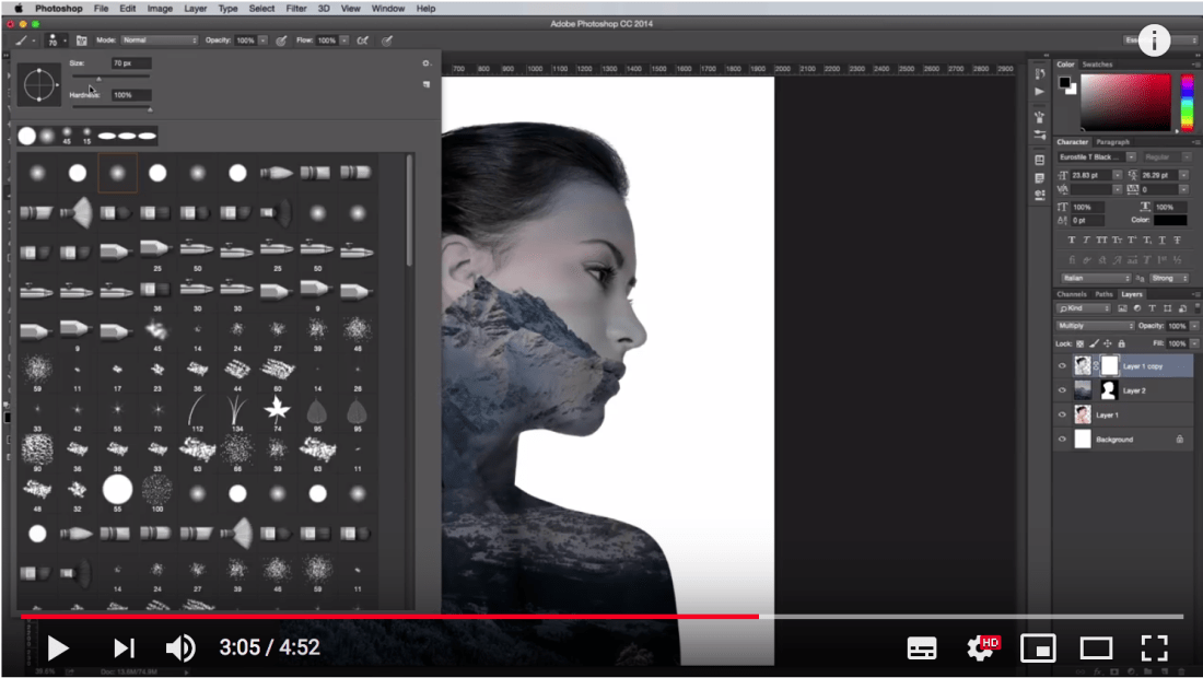
Once happy, you can reduce the opacity so the features are fading in to the landscape. From here, Deselect the layer mask, colour pick one of the main colours from your landscape, and fill the Background layer with it. You can increase/decrease the opacity of this until satisfied.
Context
The edit of this image is artistic in purpose but could be used for a number of different kinds of photography, one of which could be advertising. I can easily imagine this as part of a contemporary advertisement for a company selling alcohol, specifically vodka. This is because of the cold and sharp mountains, and the attractive woman that surrounds them. This would catch the eye of any viewer’s, particularly the younger generation.
Impact
I feel that the edit of this image is impactful because it draws the viewer in; first to the sharp contrast between the mountain and the snow that sits atop it and then on to the woman’s delicate features which are a further contrast to the mountains inside. This image gives me a feeling of calmness and tranquillity due to the quietness of the landscape as well as the model’s head being empty, as if free from worry.
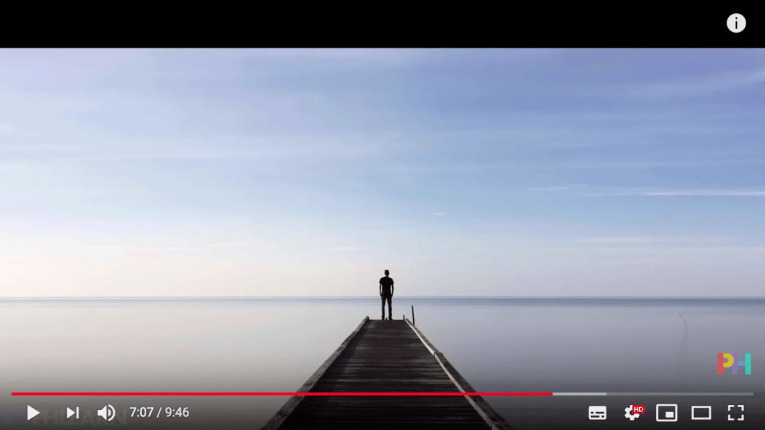
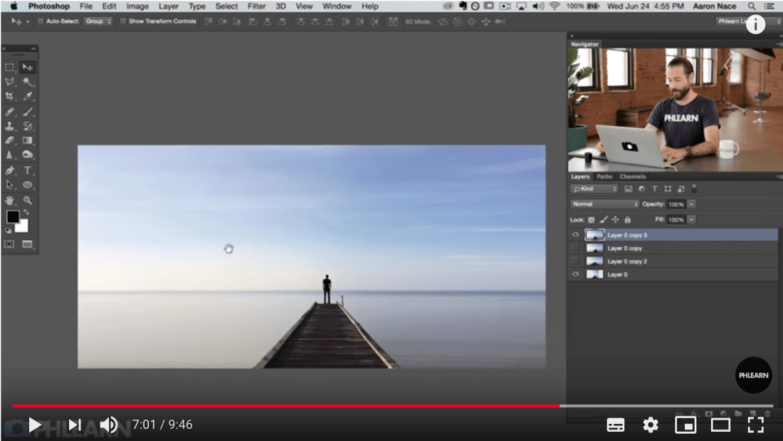
Image 2 – Content Aware Scale
By using the content aware scale, we are able to stretch an image and alter its shape. In this video from Phlearn we can see that the image was originally squarer in its shape than rectangular. Although not shown in this tutorial, we should always duplicate our background before editing. Afterward, select the “Crop” tool and crop the image to the desired size where we will fill later.
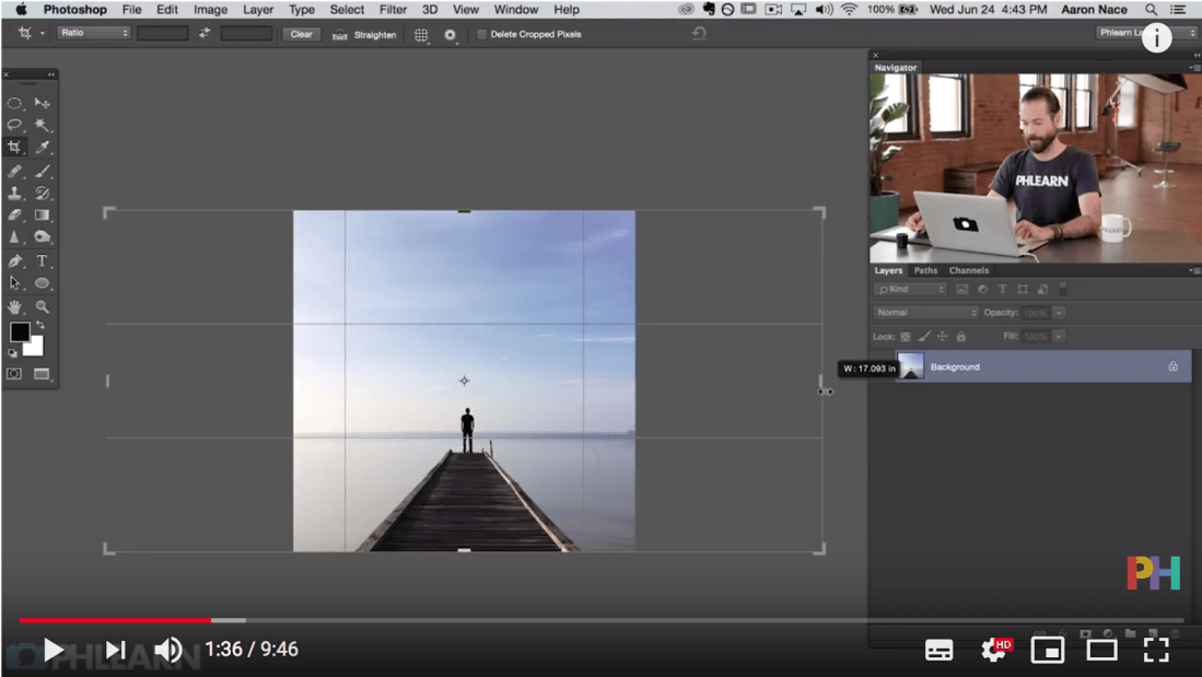
Then, to prevent the man and pier from being stretched we select them and create a channel of them (by selecting new channel in channel menu). Now, we select Content Aware Scale and then at the top we select the channel we have created from the protect menu. Then we can stretch the image.
Context
This can be used for a multitude of shots, I often use this in landscape shots to stretch the sky and the ability to protect certain areas allows you more creative freedoms.
Impact
The edit is very impactful as it allows us to give the illusion of a landscape perspective from a portrait image without looking false. It also emphasises the loneliness of the subject in the centre, which gives me feelings of peace and calm.
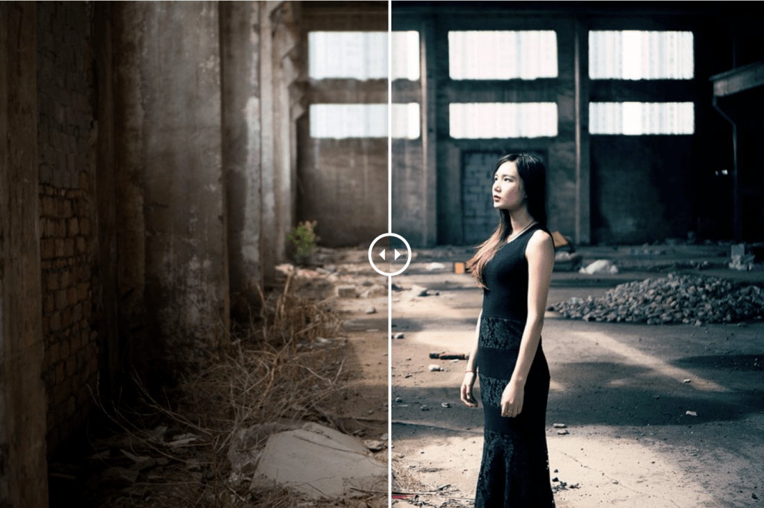
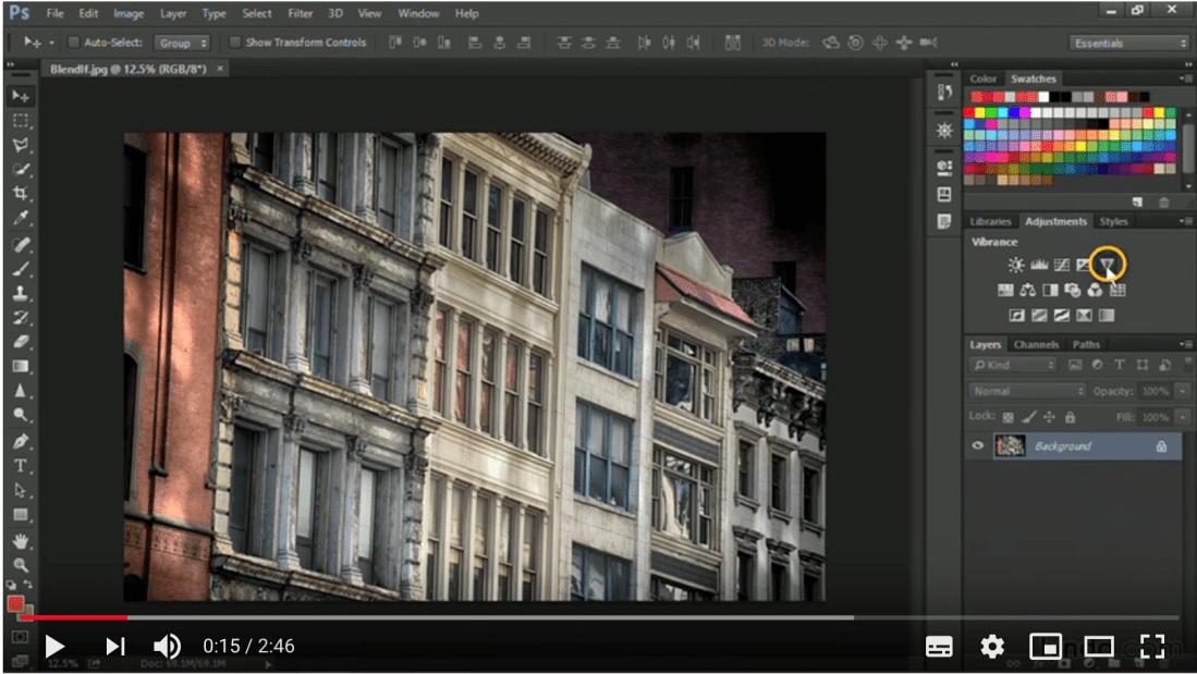
Image 3 – Colour Grading
Colour grading can be achieved through a number of ways in photoshop, but I will focus on colour grading through using the curves channels. Firstly; we create two curves channels and name one “tones” and the other “colour”. For the tones channel we will select a blend mode of “luminosity” which will not affect the colours of the image, only the intensity of the highlights/shadows etc. The colour layer will have a blend mode of “colour” which will make it so that only the colours are affected and not the luminosity.

After creating these channels, we will play around with the “tones” curve until the desired luminosity is achieved. Secondly, we will go on to the colour curves layer and adjust each channel individually. To do this we select the drop down menu “RGB” and select either the red, green, or blue channels and work on them individually. For this image the individual has added more cold tones like blues and cyans as well adding some magentas in to the shadows and highlights.
Context
This can be used for a variety of styles but is used a lot to add a cinematic feel to images. Additionally, colour grading is extremely important for images that are composites. This is so that the image blends properly and looks more real.
Impact
The edit gives this image more depth as well as creating some drama with the cool tones as the before image was flat and dull. It also gives this image a less amateur look whereas the first image did look very basic.
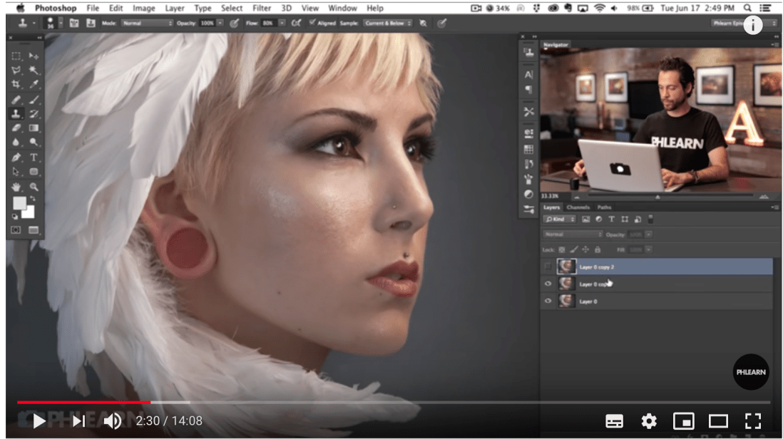
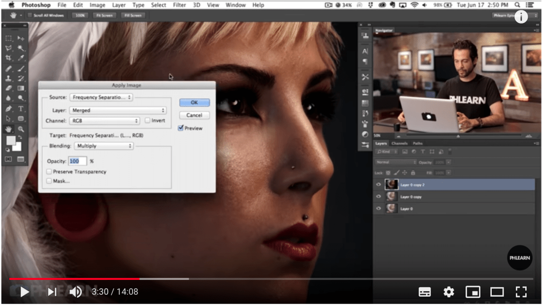
Image 4 – Frequency Separation for skin
For this tutorial we are using frequency separation to create blemish free, beautiful looking skin.
 First you need to duplicate the background layer, and then once more. We will name one of these layers “textures” and the other “tones”. We turn off the textures layers and put a gaussian blur on the tones layer, enough to blur detail but not completely ruin the image. Now we turn the top layer back on, then we need to “apply image” and change the blend mode of the tones layer to “subtract”, then we exit out of that and change the blend mode of the “texture” layer to linear light.
After this we can use the clone stamp and other corrective methods to perfect the skin on the “tones” layer without affecting the textures on top. In the video the man also uses the lasso tool to blur small sections on the tones layer to blend out imperfections with blotchiness/redness etc. Once the tones layer is perfected you can use the clone stamp or other correction tools to perfect the textures layer by improving on textural blemishes like spots/dry skin etc.
Context
This is used in magazines as well as advertising, fashion, editorial etc photography and is a very valuable tool to learn for correcting blemishes in both tones and textures.
Impact
The edit is exceptionally impactful and effective as it creates beautiful, clear skin with lots of texture and therefore doesn’t end up looking fake. By separating the layers it allows us to work more efficiently on the areas we want to correct without affecting things, like the texture, that don’t need to be improved upon.
Image 5 – Advanced Blending
 In this tutorial we are shown how to use advanced blending techniques when using an adjustment layer so that the adjustment does not affect the whole image. In the tutorial the individual uses a very strong vibrancy adjustment layer but it is affecting parts of the image in a way they do not like.
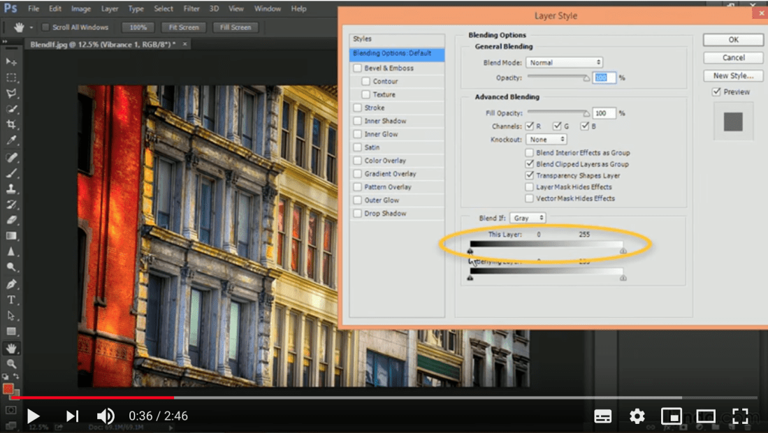 So by double clicking on the layer a pop up window becomes available where we can adjust how the layer and underlying layer looks by moving the sliders underneath the “blend if” tab. By option+clicking we add more sliders and therefore can create a more gradual blend which looks more natural. We can also change the tab from “grey” to any of the RGB colours so we can edit those tones individually which allows us even more control over our image so that we can create a more subtle adjustment as below:
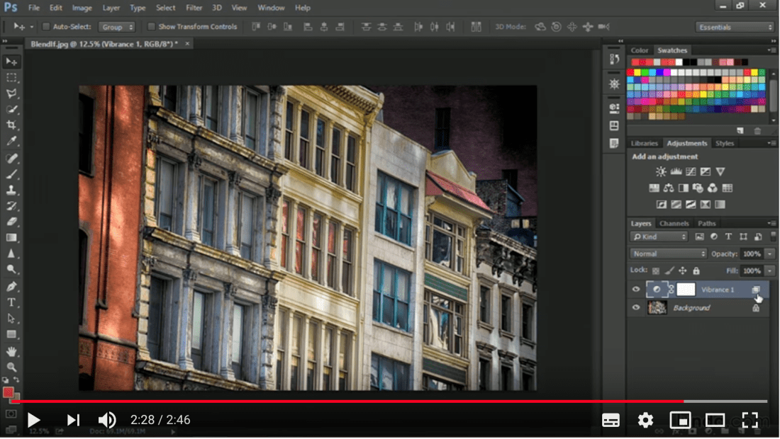
Context
This could be used in any kind of photography as it can be used with any kind of adjustment layer. Examples of this could be advertising photography, fashion photography, and architectural photography although this list is not exhaustive.
Impact
This edit allows full control over an adjustment layer and exactly how it affects the image without having to use a layer mask to brush in adjustments in certain places with varying opacity and therefore is really easy to use. The impact of this on the image is so that it looks more subtle and less falsified, whilst being simple and easy to use.
Image 6 – Creative Dispersion
For this edit the individual uses the liquify tool to stretch out an image and then uses brushes to create an effect of the trainer’s fabric unravelling and being stripped away.
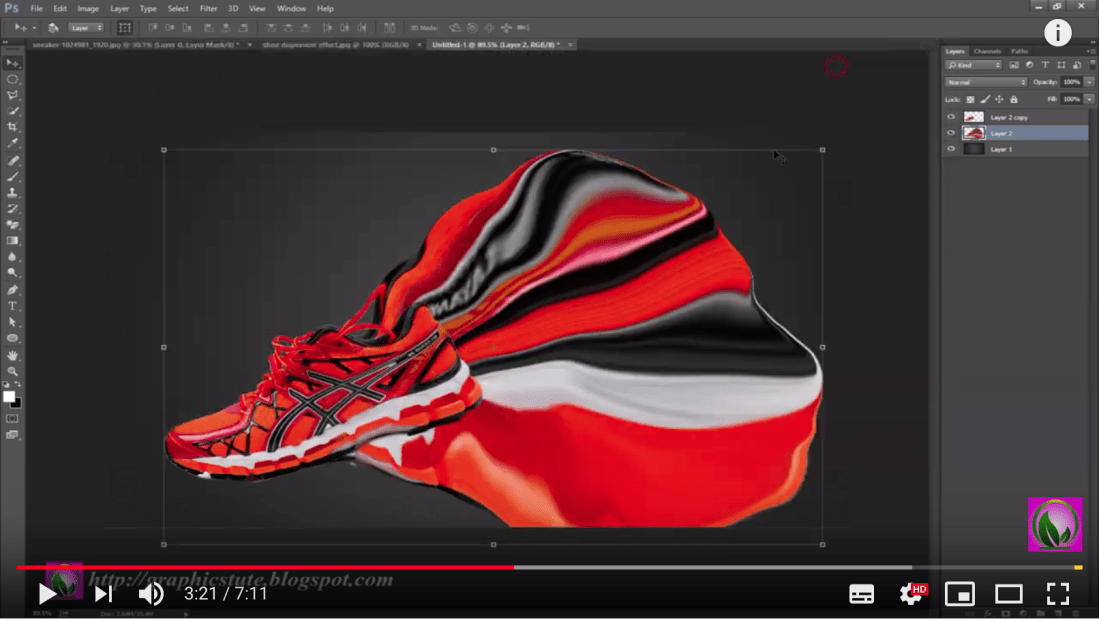 They create a copy of the original layer of the show (with no background) and then using the liquify tool on the first shoe layer they stretch the shoe out where they want it to look as if it’s been blown away into dust.
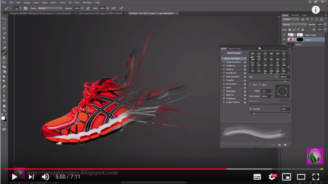
After stretching the image out, they create layer masks for both layers, inverting the liquified shoe’s mask. The tutor has downloaded a pack of abstract brushes for photoshop which allows them to brush away parts of the top shoe layer in an interesting pattern so that it looks as if it is fading. They then use a slightly different abstract brush to paint in the liquified shoe layer which gives the image the effect of the shoe unravelling and blowing behind itself.
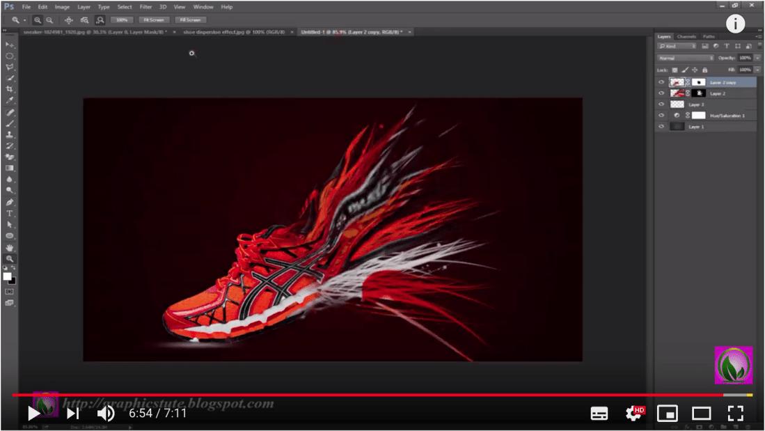
Context
This would be used more often in advertising and creative work, but could also be used to create strange images to meet the imaginations of fine art photographers.
Impact
This edit is very impactful and yet is simple; it completely changes the look of the trainer and adds a lot more interest and drama.
Image 7 – Water Effect
In this tutorial we are shown how to create water effects on an image so that it looks like the woman in the photo’s arm is turning to water!
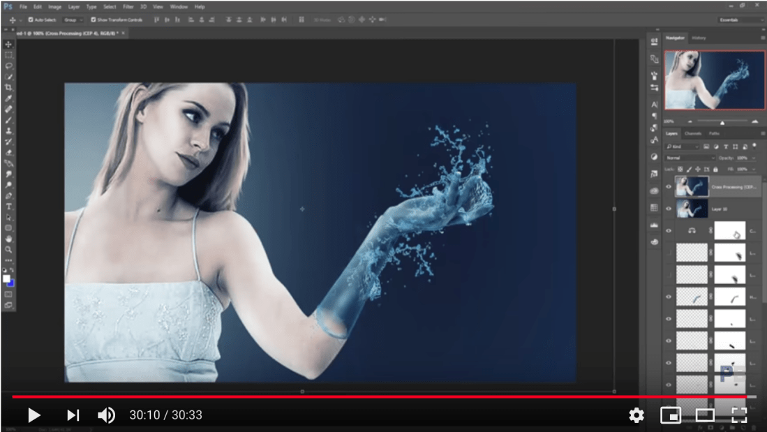
After editing the image in RAW, they select the arm above the elbow and create a new layer separate from the body.
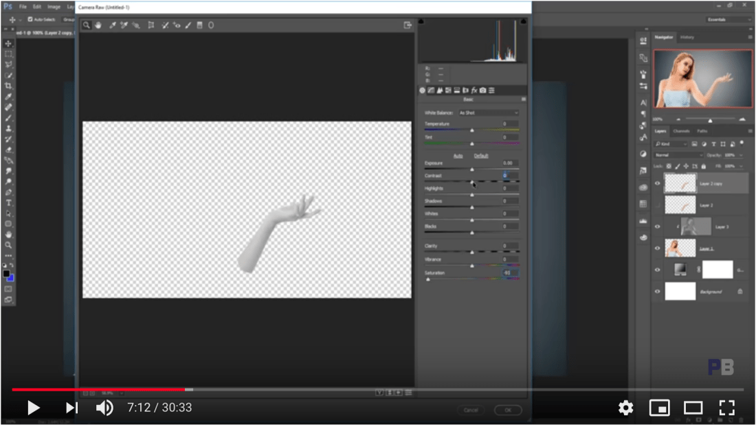 Then they make the arm layer grey and colour grade it blue before selecting and creating a gradient where the arm layer meets the body. To complete this image, they then add several different layers of water splashes and edit them using layer masks to make it look most realistic. Then, they edit the image so that the layer with the woman is cold and so matches with the water arm.
Context
This could be used in advertising, particularly for alcohol shots where you have lots of water splash effects. But could also be used in other styles of images; in advertising, and fashion.
Impact
This is impactful as it could be used in a variety of different ways; not just water. We could use this to create fire, ice, and many other creative outputs. It creates a completely new and much more interesting image and actually looks quite realistic as well!
Image 8 – Pen Paths
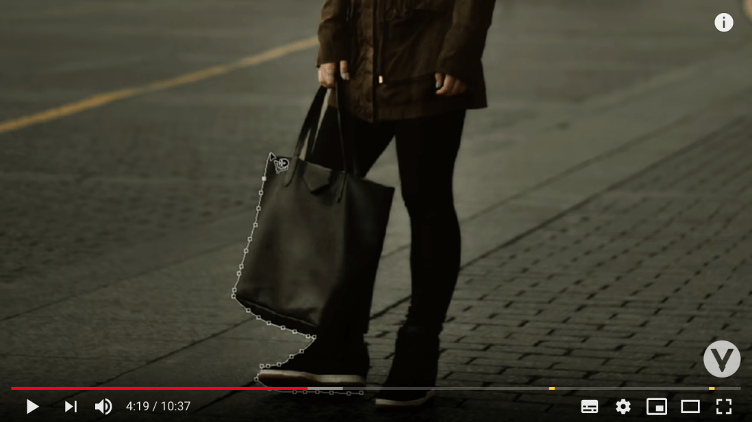
By using the pen path we can cut out anything; regardless of the background. By using the pen path tool, we first place control points all around the subject that we want to cut out; then we use the handles on the control points to curve the lines so that they fit perfectly around what we want to cut out. Once we have created the path we can create a new layer with our selection and then paste it on to any background we like.
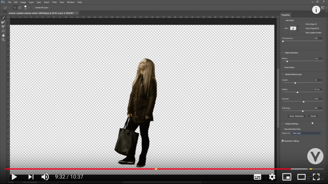
Context
This could be used for a multitude of photography genres including advertising such as cutting out shoes, fruits, bottles etc or used in fashion photography where we could shoot a model in the studio and shoot the background on location and composite them together.
Impact
This is very affective as it can be used to create high fashion shots in different locations as well as being able to use it for more creative photography projects such as advertising shots where we could create water splashes on bottles, or floating trainers on interesting backgrounds.
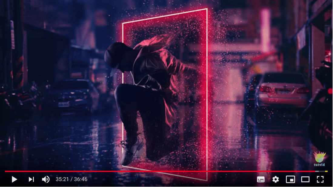
Image 9 – Portal to Another Dimension
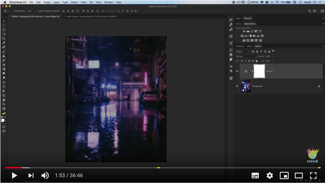
We start this tutorial with a funky night shot with lots of blue and magenta tones. We then create four rectangles, three pink and one very pale yellow on the top layer. For each pink rectangle we make the layer a smart layer and then add a gaussian blur on each rectangle with the most blur on the bottom, around 35 pixels, and the two other layers both 25 pixels blur, then from bottom to top we change the blend modes to; screen, soft light, and normal. Then with the top yellow rectangle we change the blend mode to soft light and duplicate it until there are four yellow rectangles, keeping the middle two rectangles with a blend mode of normal, we then change the top layer to a blend mode of linear dodge, and change the opacity to around 80%. Then, we select all of the yellow rectangles and transform them by pressing CMD+T, then we select perspective and make the left side slightly smaller.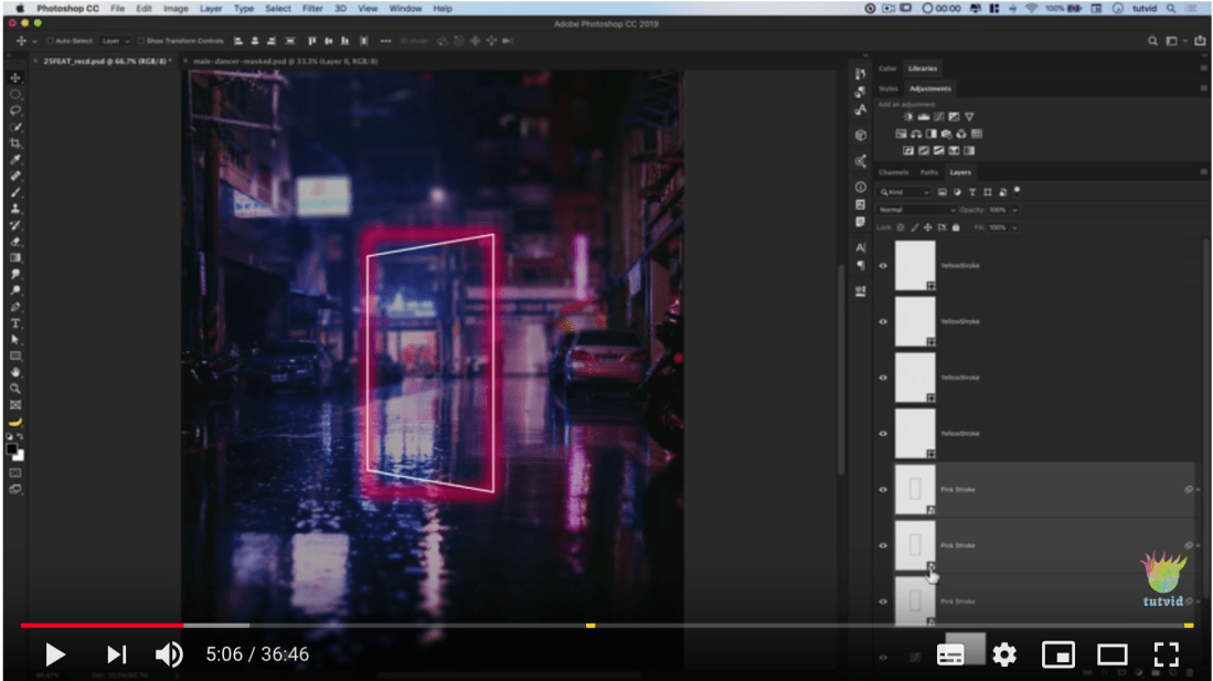
Then we want to do the same with the pink layers so that the perspective is matched with the yellow triangles. Then by creating a curves layer and selecting the inside of the rectangle we bring down the exposure inside the rectangle in preparation for placing the subject jumping out of it. Then they use a special brush to create pink dust particles all around the rectangles on a new layer and then create a pink ellipse underneath the rectangle blurring it to be like a glowing shadow.
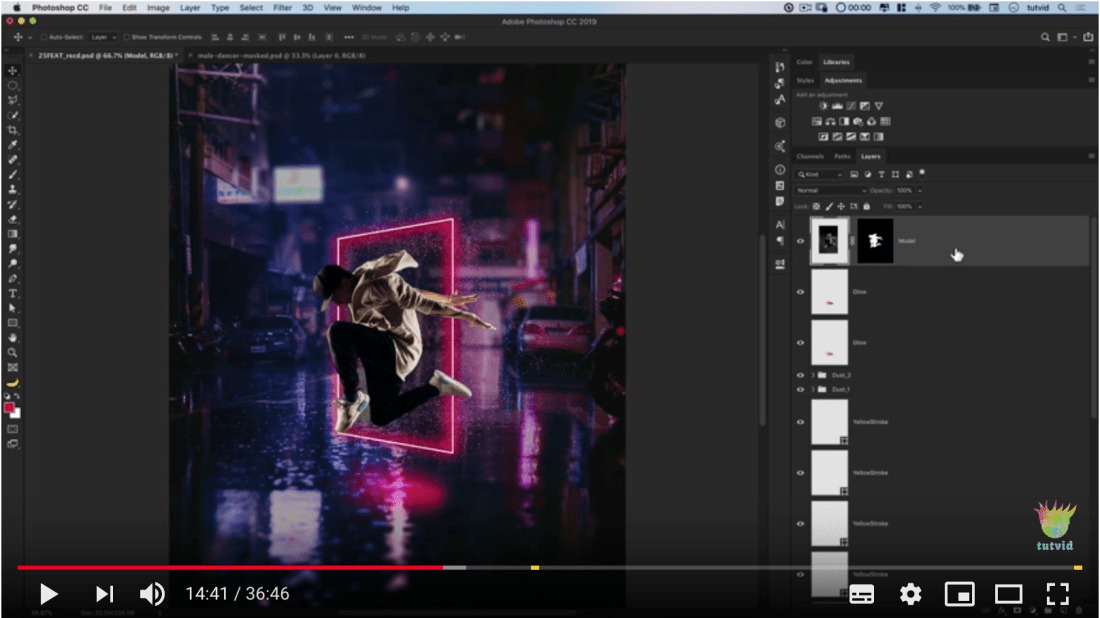 We insert the layer of the subject jumping through and by creating a layer mask we brush away the parts of the body that are still inside the frame, and finishing touches we use two curves layers on colour mode with a layer mask to brush in some magenta/pink tones where the model meets the frame and some blue tones at the left of the model where they are furthest from the frame. Finally, we add some extra pink dust spots on top.
Context
This could be used particularly for advertising; I could easily see this advertising a new clothing brand or even being on the front cover of an album. However, these types of techniques could also be used in fashion photography, and even landscape photography to create some exciting and unusual images.
Impact
I found this edit to be the most impactful over all of the previous ones that I had researched; it completely changes this image and makes it otherworldly! I really enjoyed the tutorial and found that the tools used are transferable to a lot of different images and so could be used in a variety of different, exciting ways.
Image 10 – High Pass Sharpening and Smart Objects
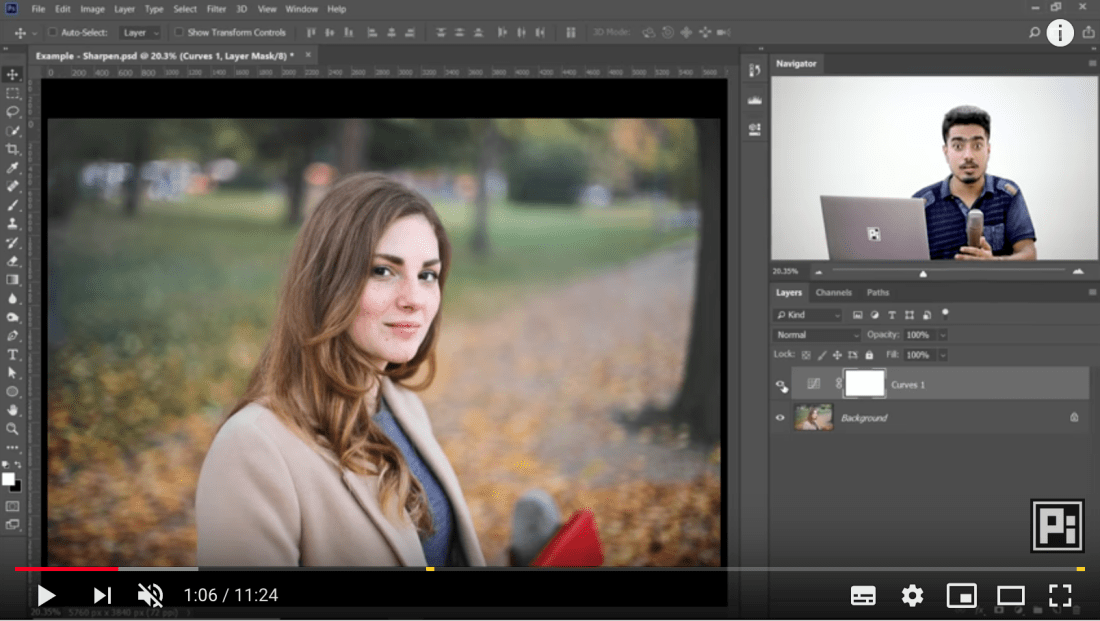
In this tutorial we are shown how to use high pass filters for sharpening. After editing this image in RAW and then adding a curves layer, the tutor then selects CMD+OPTION+SHFT+E to create a stamp of the layers which basically means we are creating a layer which encompasses all of the layers below for easy editing. 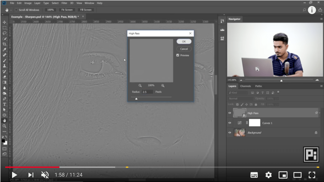 Then, we will make this layer into a smart object by selecting “filter” and then “smart object”; this allows us to change the values of the high pass filter later on. Once we have created the smart object we will then select “filter”, “other”, “high pass filter” and the tutor selects a value of 2.5 so that we have enough detail to define without creating a halo effect on the image. Finally, we change the blend mode of the layer to “overlay” which takes all of the grey away and blends it so that we only see the sharpness from the filter.
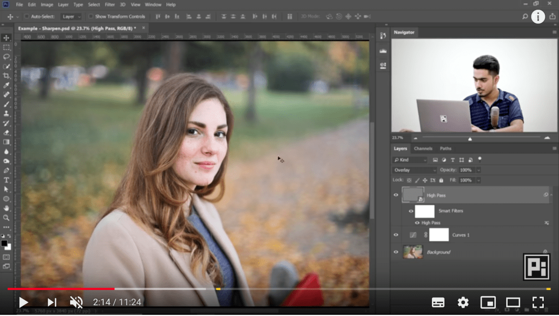 Context
This could be used in literally every genre of photography; high pass filters can be used for sharpening any image and using smart objects is valuable on any layer where you want to be able to continue to edit the layer.
Impact
The impact of both of these edits (high pass filter and smart object) are very effective; we can see that the image is much sharper and therefore aesthetically pleasing now that it has the high pass filter. Additionally; if we decide the image is too sharp or not enough sharp later on we can still go in and change the settings without having to create a new layer.
Bibliography
Online Sources
- https://www.youtube.com/watch?v=Mbf-QXCCXgM [Accessed 28.09.18]
- https://www.youtube.com/watch?v=GM9sisF4OEI [Accessed 30.09.18]
- https://www.graphicadi.com/cinematic-color-grading-photoshop/ [Accessed 19.01.19]
- https://www.youtube.com/watch?v=ldhG9fmgC7o [Accessed 23.01.19]
- https://www.youtube.com/watch?v=6OhtCtdpeps [Accessed 23.01.19]
- https://www.youtube.com/watch?v=HYOVhHevhZk [Accessed 23.01.19]
- https://www.youtube.com/watch?v=Y2zasFBAGck [Accessed 23.01.19]
- https://www.youtube.com/watch?v=Hw0-SehGcgg [Accessed 25.01.19]
- https://www.youtube.com/watch?v=J2M3b-nsGvQ [Accessed 25.01.19]
- https://www.youtube.com/watch?v=Km-vamYhknY [Accessed 27.01.19]
